
The Only Six Fonts You Need to Know
If you had to guess right now, how many fonts do you think there are?
I’ll be honest. I have no idea.
ChatGPT says there is not really a way to know the exact number. But to put it in perspective, MyFonts alone has more than 300,000 fonts available.
Here’s what I know for sure.
You really only need to know six.
The Vignelli Approach
Massimo Vignelli was one of the great graphic designers of the 20th century. Among many other things, he helped create the design system for the New York City subway.
He also had some strong opinions about fonts.
Vignelli believed designers had way too many typefaces to choose from. Instead of finding a new font every time he made something, he kept coming back to a small group that worked.
His famous six were Garamond, Bodoni, Century Expanded, Futura, Times Roman, and Helvetica.
So let’s talk about them.
Helvetica
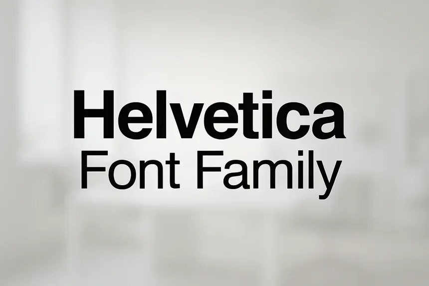
If you know one font from this list, it is probably Helvetica.
Helvetica is clean, simple, and easy to read. It does not scream for attention, which is part of why it works so well.
You can use it for a headline, a sign, a website, or a paragraph. It gives you the words and then gets out of the way.
There is a reason Helvetica became closely tied to the New York City subway system. When people need to read something quickly, clarity matters.
Garamond
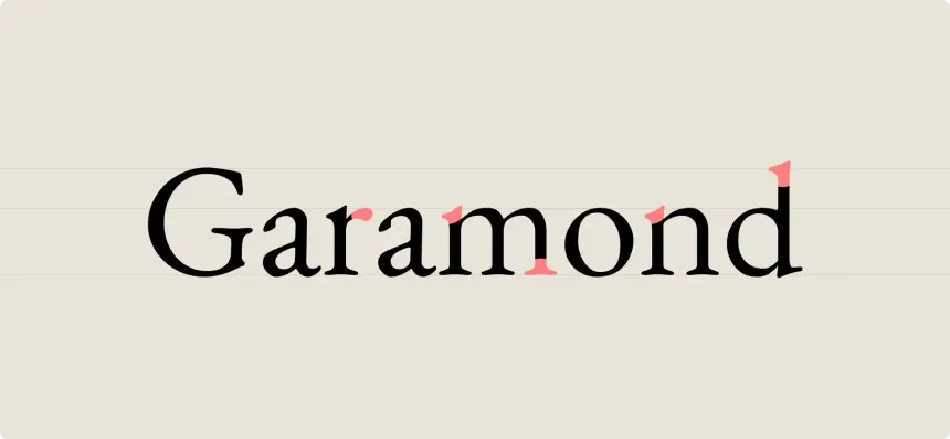
Garamond feels very different.
It is an old serif typeface with a softer and more traditional look. It works especially well when you have a lot of text that someone needs to sit down and read.
Open a book and you will understand why this kind of type works. The letters have character, but they do not fight with the words.
If Helvetica feels modern and direct, Garamond feels classic and human.
Bodoni
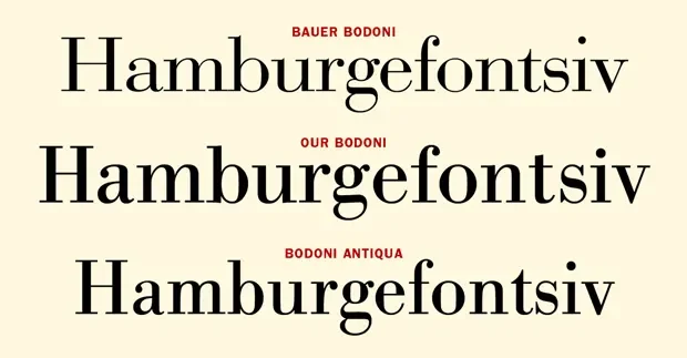
Bodoni has more attitude.
It has thick and thin strokes with sharp contrast between them. That makes it feel elegant, dramatic, and a little more luxurious.
You probably would not use Bodoni for every paragraph on your website. But for a large headline, logo, poster, or something that needs a high-end feel, it can be beautiful.
Bodoni shows that a font can have personality without becoming hard to understand.
Century Expanded

Century Expanded was made with reading in mind.
It has large, clear letters and a traditional serif style. It feels familiar, which is often a very good thing when someone needs to read a lot of information.
This is not a font that needs to be the star of the show. It does its job.
Sometimes that is exactly what good design needs.
Futura

Futura feels like someone took a ruler and a compass and started drawing letters.
It is geometric, clean, and modern. The shapes feel simple because many of them are built around basic forms like circles and straight lines.
That gives Futura a very different personality from Helvetica. Both are clean, but Futura tends to feel more designed.
It is great when you want something bold and modern without making it strange.
Times Roman
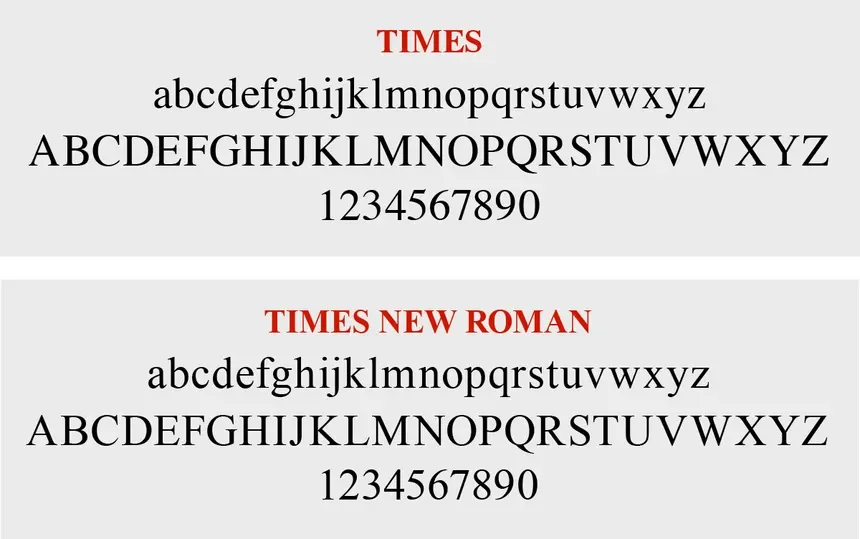
You have probably seen Times more than almost any other font on this list.
For that reason, some designers may think it is boring.
I think that misses the point.
People know how to read it. It feels normal. It has been used for newspapers, documents, books, and countless other things for decades.
Sometimes familiar is good.
Your Font Does Not Need to Be Special
There is a temptation when building a brand to make everything unique.
You need your special colors. Your special logo. Your special style. And, of course, your special font.
But sometimes your font does not need to define your brand.
Sometimes it just needs to work.
People already know how to read Helvetica. They are comfortable looking at Garamond. Futura has been around for generations and still looks good.
There is value in that familiarity.
Not everyone needs to find some forgotten font and claim it as their own. And you definitely do not need to build your whole brand around Wingdings just to be different.
Especially when you are designing for screens, readability should come first.
Pick something that looks good.
Pick something that is comfortable on the eyes.
Pick something that works.
Then let the rest of your design do the talking.
